Reading isn’t just for books and reports, it’s essential for marketing, too. Especially when it comes to your flags. If people can’t read your flag while driving by or walking through a busy crowd, your message is getting lost. And when your message is lost, so are your opportunities. This is why readability matters on marketing flags.
Big, Bold, and To the Point
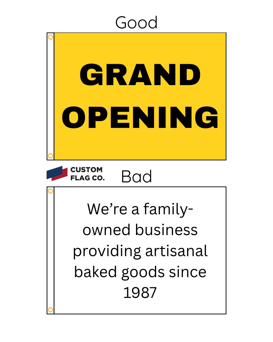
Think of your flag like a billboard. If the text is too small or hard to read, people will glance and move on. Big, bold fonts and high-contrast colors are key. They’re what help your message stand out and stick.
You have about 3 seconds, if that, to make an impression. Something like “GRAND OPENING” works great. A longer sentence like, We’re a family-owned business providing artisanal baked goods since 1987. That’s not going to land.
Color Contrast Counts
Highlighters work for a reason, they are bright, high-contrast colors that grab attention. Your flag should follow the same logic. Think white on red, black on yellow, or any combination that makes your message pop. If your text fades into the background, your flag becomes decoration, not a marketing tool.
Keep It Simple
Flags aren’t meant to tell a full story. They’re like flashcards, quick, powerful, and memorable. One or two impactful words do more than a long sentence. Examples that work:
- SALE
- OPEN
- FREE TACOS (because who wouldn’t stop for that?)
Short and bold always wins.
Why It Matters
At Custom Flag, we believe your flag is more than just fabric, it’s your brand’s outdoor voice. A well-designed, readable flag can attract attention, draw customers in, and increase foot traffic to your business.
Want to make sure your flag is working as hard as you are? Let’s design one that speaks clearly, loudly, and effectively. Ready to stand out? We’re here to help you fly your message high, and make sure it’s seen.



Leave a Reply
You must be logged in to post a comment.